
A website that adapts to your clients, not the other way around
Today, your clients may visit your website from a mobile phone, tablet, laptop or large-format screen. That is why a professional website should not be designed to look good on just one device: it must provide a clear, fast and comfortable experience on every screen size.
At Lenixas Web Design Studio we design responsive websites that automatically adapt their structure, images, text and interactive elements to the device used by each visitor. The result is a modern, consistent and easy-to-use website, regardless of how your clients access it.
It is not simply a matter of reducing the size of a page. It is about reorganising all the content correctly so that every section retains its visual impact, legibility and commercial purpose.
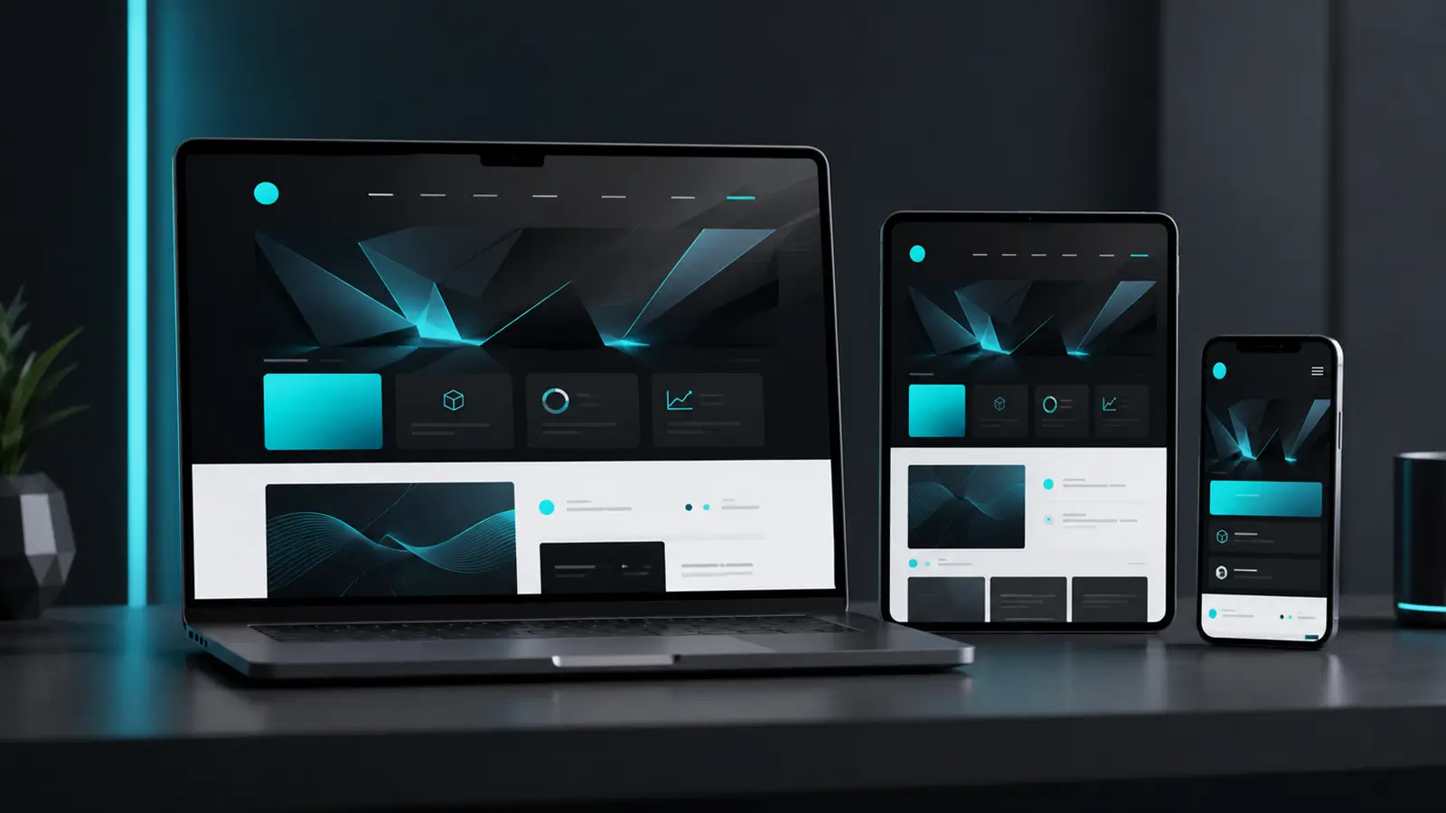
Much more than adapting a website to different screens
Responsive design, also known as Responsive Web Design or RWD, allows a website to reorganise its elements intelligently according to the width and orientation of the screen.
On a computer, users may see several columns, large-format images and a full menu. On a mobile phone, those same elements should be presented more simply: columns are placed one below another, buttons have larger touch areas and the menu is transformed to make touchscreen navigation easier.
Every version should preserve the company’s visual identity and guide users towards the most important information.
A more comfortable user experience
A responsive website prevents visitors from having to zoom in, scroll sideways or search for buttons that are too small. Information is presented in an organised way, with legible text, suitable spacing and clearly visible calls to action.
When a website is easy to use, users stay longer, view more content and are more likely to contact the company or request a service.
A design consistent with your brand
Your company should convey the same professional image across all devices. That is why we pay close attention to typography, colours, proportions, images and the arrangement of every section.
The design is not copied automatically from one screen to another. We analyse how each element should behave to maintain visual balance and communicate your brand values correctly.
Intuitive navigation on mobile devices
A large proportion of website visits come from mobile phones. For this reason, we design with user comfort in mind: clear menus, accessible buttons, simple forms and content organised according to its importance.
The aim is to ensure that anyone can quickly find what they are looking for and contact you without complications.
Performance and loading speed
A responsive website should also be fast. We optimise images, structure and different visual elements to avoid unnecessary loading and improve the website’s overall performance.
Smooth navigation conveys professionalism, reduces the bounce rate and allows users to access content even when using slower mobile connections.
A structure prepared for SEO
A website that is properly adapted to mobile devices makes reading and navigation easier for both users and search engines. It also allows a single version of the website to be maintained, avoiding duplicate content and unnecessarily complicated structures.
We create an organised technical foundation with headings, content and sections prepared to support the continued development of your business’s organic search visibility.
How we develop a responsive website
Every project begins with an analysis of the company, its services, target audience and the objectives the new website must achieve. We do not use one generic structure for every business. We design each website according to how its clients search for information and make decisions.
1. We define the content structure
We organise the pages, sections and main elements so that users can quickly understand what your company offers and how they can contact you.
2. We design the desktop version
We create an attractive and balanced visual composition that makes proper use of the space available on larger screens.
3. We adapt every section for tablets and mobile phones
We review the text, images, columns, icons, forms, buttons and menus individually. Every element is reorganised to preserve its usefulness and visual impact.
4. We test the navigation
We test the website at different resolutions to identify possible issues with reading, alignment, sizing or functionality.
5. We optimise the final details
We adjust spacing, font sizes, images and calls to action so that the experience remains consistent across all devices.
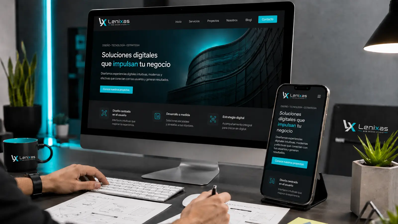
What does responsive website design include?
As part of the project, you will receive a complete website designed to work correctly across different devices and adapted to the real needs of its users.
The project may include:
- custom website structure and design,
- adaptation for computers, tablets and mobile phones,
- responsive menu and navigation,
- proper arrangement of text, images and buttons,
- contact forms that are easy to use on mobile devices,
- optimisation of images and visual elements,
- a basic structure prepared for SEO,
- social media integration,
- functionality testing at different resolutions,
- the possibility of expanding the website in the future.
The scope of each project is adapted to the type of business activity, the number of subpages and the functions required by each company.
Your website should work for your business
A responsive website is not an optional extra. It is a fundamental part of a professional digital presence.
Your website should present your services correctly, build trust and make contact easy at any time and from any device. Every section should have a purpose, every element should be positioned correctly and every visit should become an opportunity for your company.
At Lenixas Web Design Studio we combine design, functionality and strategy to create websites that not only look attractive, but also help businesses grow.
Create a website designed for your clients
Tell us what your company needs and we will prepare a solution tailored to your objectives, brand image and industry.